Case Study

Vendor Payment Preferences

At AppFolio, our payments team set out to solve a deceptively simple problem: helping property managers pay their vendors faster and more easily. Over 18 months, I partnered closely with two product teams  to redesign how vendors shared payment information and how property managers enabled online pay. Together, we transformed a fragmented, trust-sensitive experience into a secure and scalable payment flow that vendors could confidently adopt. This feature generated $254K in revenue in 2023 and helped us achieve a 108% delivery of our revenue goal in 2024.

Type

Company

Tools

New feature in B2B SaaS portal
AppFolio
Figma,

The Challenge

Property managers were our primary customers, but the success of online payments depended on vendors. The problem was that vendors were difficult to reach, hesitant to adopt digital payments, and deeply reliant on predictable cash flow.

Checks felt safe. Digital payments felt risky. Even small delays could mean missed payroll or personal expenses. To move adoption forward, we needed to design an experience that felt just as reliable and far more convenient than paper checks.

What I Learned From Vendors

To understand how vendors actually experienced getting paid, I immersed myself in their world. I joined forums, reached out directly, and used lightweight research touchpoints to build trust and gather insights.

Three themes stood out:

1) Timing matters. Vendors plan their finances around payment schedules, and uncertainty creates real stress.

2) Checks feel familiar. They simplify reconciliation and provide a tangible sense of control.

3) Trust is important. Vendors were wary of digital payments unless the experience felt simple, transparent, and secure from the very first step.

These insights shifted our focus. This was not just a payments feature. It was a trust-building exercise.

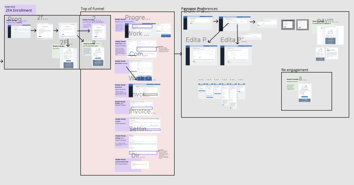
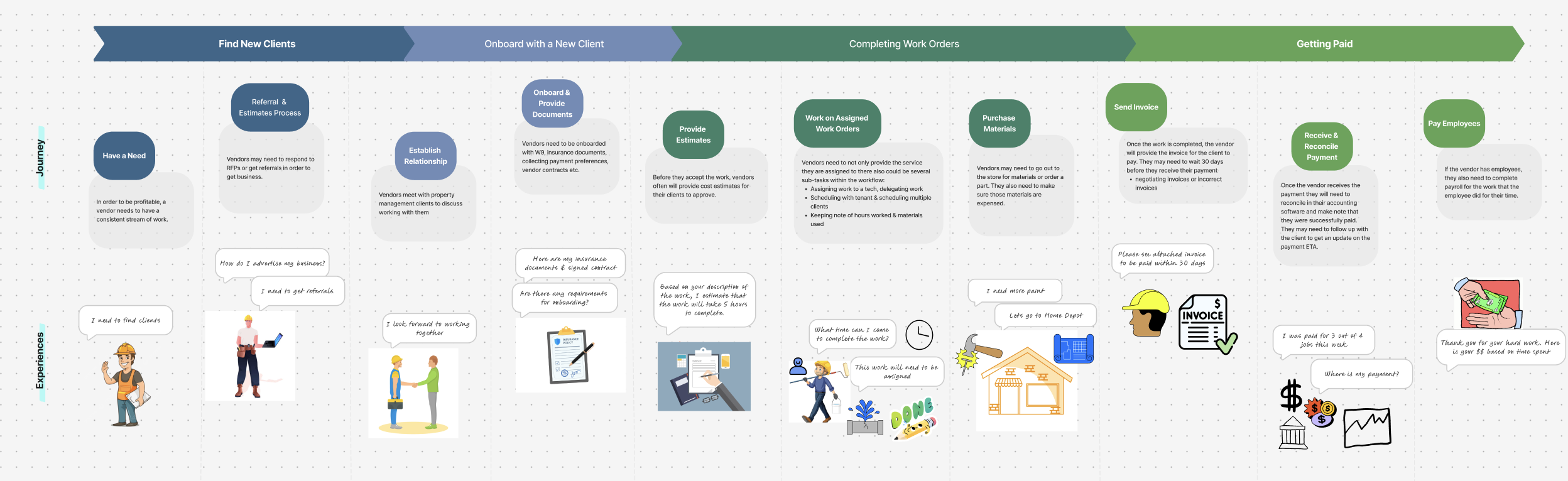
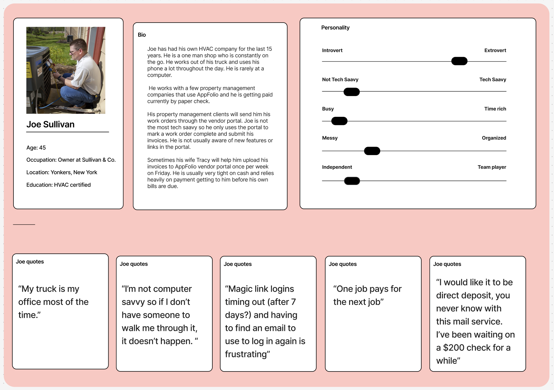
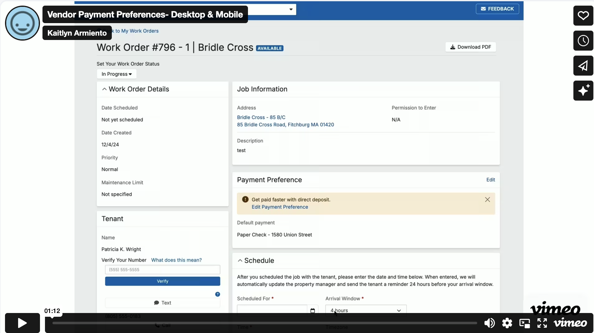
The Design Direction

We focused on creating a vendor-first experience that made payment selection clear, secure, and easy to complete. The initial launch prioritized letting vendors choose how they wanted to be paid, while parallel work strengthened security through two-factor authentication.

To address vendor demand for faster access to funds, we introduced Instant Pay through a third-party integration. This gave vendors flexibility while preserving transparency around fees and timing.

Behind the scenes, shifting technical constraints required frequent iteration. Payment logic changed, backend limitations surfaced, and flows were reworked more than once. I continuously adapted the designs to keep the experience cohesive, even as the system underneath evolved.

Validation and Iteration

Early testing revealed subtle but critical usability issues. Vendors missed confirmation states, misunderstood calls to action, or abandoned the flow when it felt redundant.

One moment stood out. During beta, I noticed vendors repeatedly clicking “cancel.” Conversations revealed the issue: vendors already using eCheck were being prompted to reselect payment preferences unnecessarily. We fixed the flow, removing friction for existing users and improving confidence across the experience.

Ongoing feedback loops helped us clarify payment options, visually differentiate Instant Pay from Direct Deposit, and simplify decision-making without overwhelming users.

Click on video to view prototype.

Growth and Expansion

After launch, we shifted focus from usability to growth. Vendors were adopting, but property managers wanted more control and visibility.In response, we introduced configurable settings that allowed property managers to opt vendors into features intentionally. This balance of flexibility and control unlocked broader adoption and reduced friction on both sides of the marketplace.By the end of 2023:

Nearly 25,000 vendors selected a payment method

62% switched from paper checks to online payments

22% chose Instant Pay
, driving meaningful new revenue

Continued Impact in 2024

In 2024, we introduced regular Walk the Store sessions to proactively identify friction. One small but powerful improvement was removing unnecessary steps for vendors with only one client. That change alone significantly improved task completion and usability scores.

It reinforced an important lesson: when trust is earned, even small reductions in friction can unlock meaningful impact.

Lessons Learned

This project reinforced how continuous discovery plus iterative design directly increases conversions and revenue. Every improvement cycle, from prototype validation to post-launch enhancements, fed into our “Walk the Store” practice, shaping how design now drives sustainable growth across AppFolio’s ecosystem.

More Case Studies