
One moment everything feels normal; the next, breathing becomes a conscious effort. For millions of people, and the caregivers who watch closely, that uncertainty defines daily life.
Google Aria was imagined as a lifeline: an Android app that helps users monitor and manage asthma in real time. The goal wasn’t just to track symptoms, but to create a calm, proactive experience that helps users feel supported before an attack happens — all while staying true to Google’s Material Design.
Asthma affects 39.5 million Americans, including 10.5 million children. Yet the biggest challenge isn’t medication — it’s anticipation. Many emergency visits happen because symptoms and triggers aren’t tracked consistently, leaving users unsure when or why attacks occur.
To understand this firsthand, I conducted research and interviewed five asthmatics and caregivers (ages 31–65). What emerged was a shared emotional burden: fear of missing early warning signs, especially when caregivers weren’t physically present.
Existing asthma apps didn’t help. Most felt clinical, cluttered, or reactive — focused on logging events after they happened rather than preventing them.

Across interviews and research, three needs became clear:
1) Users wanted alerts before symptoms escalated, not just logs after the fact
2) Caregivers needed peace of mind when they couldn’t monitor breathing themselves
3) Everyone wanted to understand patterns and triggers, not just isolated attacks
Asthma management needed to feel less like hospital equipment — and more like quiet reassurance.
Based on my research I defined the target user of the app to be a parent administering medication to their child. Linda's main priority is to help her son Mason with his asthma conditions.
Her goal is help prevent his asthma attacks by better understanding his triggers and avoiding conditions that may cause asthma.

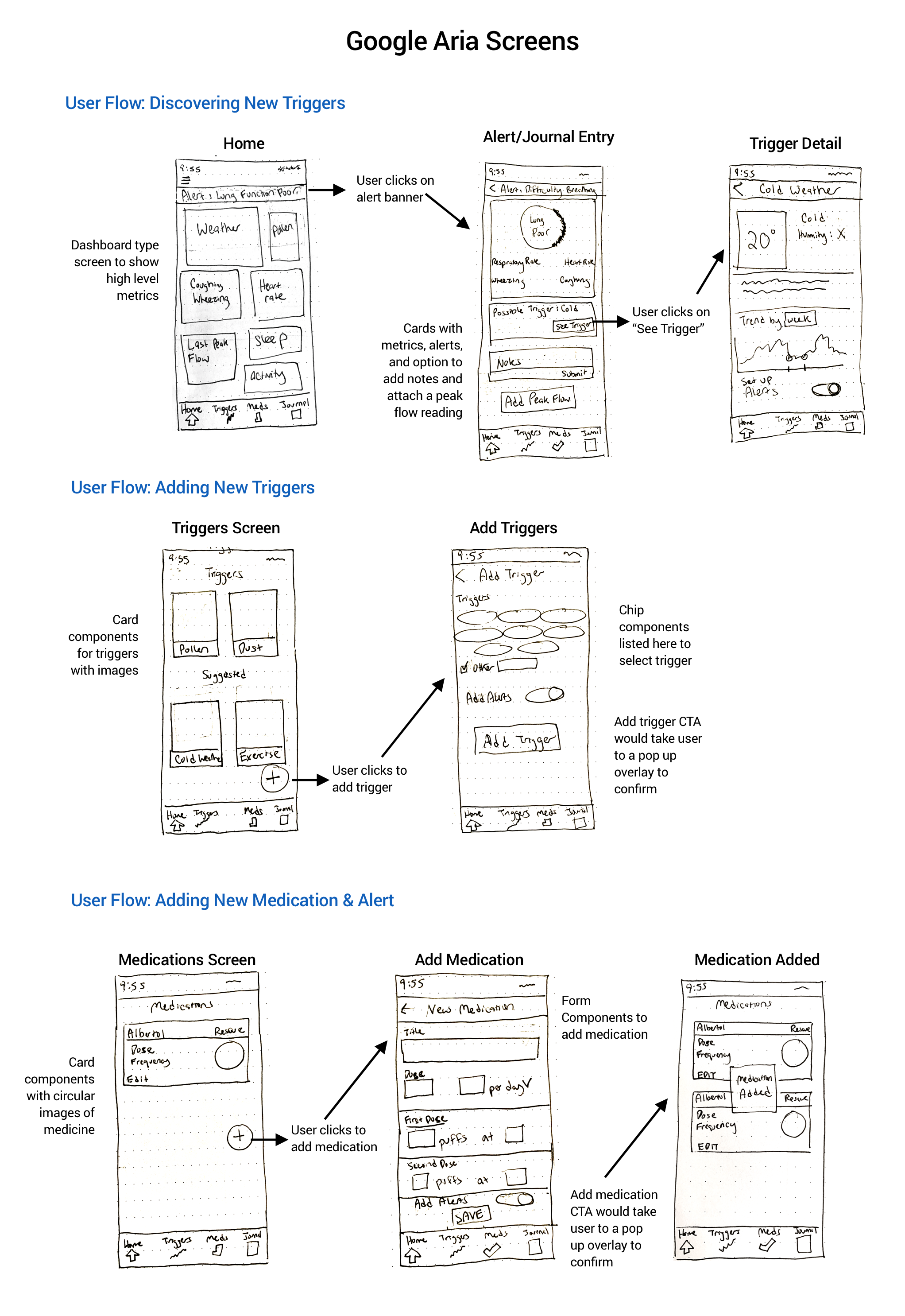
Google Aria brings together real-time monitoring, predictive insights, and gentle guidance.
Core features include:
= Trigger alerts for environmental conditions like pollen, humidity, and air quality
- Attack and symptom tracking to reveal hidden patterns over time
- Oxygen and peak flow monitoring through wearable integration
- Medication reminders that keep users and caregivers aligned
The app was structured into four simple areas — Dashboard, Triggers, Medications, and Journal — designed to be usable even by a stressed parent at 3 a.m.
Based on research and product features, I focused on 3 major flows within the app:
1) Discovering a new trigger based on breathing conditions
2) Adding a new trigger & alert
3) Adding a new medication & alert
By looking through the Material Design elements, I started sketching out the flows based on specific UI elements and data necessary to complete the actions of the user flows.

By integrating shapes and motion reminiscent of a quick inhale and the structure of lungs, the design evokes the feeling of preparing for a peak flow meter test—connecting the visual identity directly to the user’s breathing experience. Leveraging Google's customary four colors and typographical style ensures that the app appears part of Google's product line to consumers.

I tested the prototype with five users (ages 28–43). All participants successfully understood and used the core features, including alerts, medications, and trigger tracking. Minor confusion around alert visibility and button language informed refinements to make key actions clearer and more immediate.

Build out additional mobile screens
After priority revisions are made, I would like to build out the other task flows like the initial set up process, journal page, adding a peak flow reading, and more.
Working on this project was both a learning experience and a personal one. I strengthened my skills in Material Design and mobile UX, but more importantly, I gained empathy for caregivers navigating asthma management. Having grown up with asthma myself, I realized how much an app like this could have supported my parents in understanding my triggers and easing their worry during attacks.